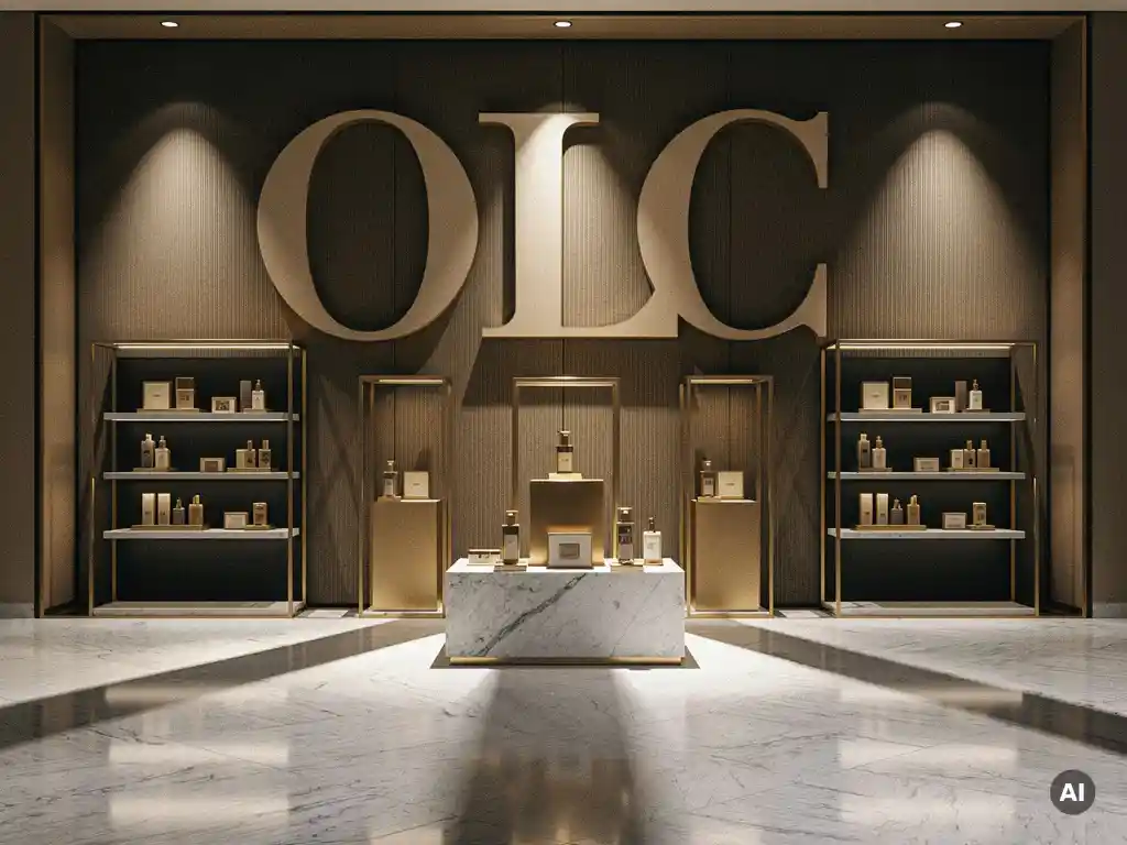
Typography directly affects brand perception in retail spaces by communicating personality, quality, and intent before a single word is consciously read. Font choice, scale, spacing, and hierarchy work together to signal whether a brand is premium or accessible, authoritative or playful, modern or heritage-led. The sections below address the most important questions retail brand managers and store designers face when making typographic decisions.
Font choice signals brand personality in a store by triggering immediate, subconscious associations in shoppers. A serif typeface communicates heritage, credibility, and refinement. A geometric sans-serif reads as modern and efficient. A hand-lettered script suggests craft and authenticity. These associations form within milliseconds of a shopper entering a space, shaping their expectations of product quality and price positioning before they engage with any product directly.
The relationship between typeface and brand personality is not incidental. Retailers and brand owners who invest in retail display design understand that typography is a primary visual asset, not a secondary detail. A luxury skincare brand using a condensed, high-contrast serif on its in-store fixtures projects authority and exclusivity. The same product displayed in a rounded, friendly typeface would undermine that positioning entirely, regardless of the quality of the product itself.
Consistency is equally critical. When the typeface used on in-store signage, display units, and packaging aligns with the brand's broader visual identity, shoppers experience a coherent brand world. Inconsistency, even subtle inconsistency, creates cognitive friction that erodes trust and dilutes brand recognition over time.
Typography plays a navigational role in retail environments by creating a visual hierarchy that directs shopper attention and movement. Large, bold headline type draws the eye to key zones or promotional messages. Medium-weight category labels help shoppers orient themselves within a floor plan. Smaller, detailed body copy supports product discovery at close range. When these typographic layers are applied consistently, shoppers move through a store with greater confidence and efficiency.
Effective in-store typography functions as a silent wayfinding system. It reduces the cognitive load on shoppers by making decisions intuitive rather than effortful. When a shopper can identify a product category or a promotional offer at a glance, dwell time becomes purposeful rather than confused. This directly influences conversion rates and average basket value.
Hierarchy is the operative principle. Retail signage typography should follow a clear three-level structure: primary messaging at the highest visual weight, secondary information at mid-weight, and supporting detail at the lightest weight. Departing from this structure, whether by using too many type sizes or insufficient contrast between levels, collapses the navigational logic the system is designed to create.
Typography works alongside colour and materials in retail design as part of an integrated visual system, where each element amplifies or undermines the others. A well-chosen typeface loses its impact if it is rendered in a colour that conflicts with the brand palette or applied to a material surface that reduces legibility. Conversely, the right combination of type, colour, and material can elevate a display from functional to genuinely compelling.
Colour and type interact in two primary ways. First, contrast: sufficient tonal contrast between type and background is essential for legibility, particularly at the viewing distances common in retail environments. Second, tone: warm or cool colour temperatures carry emotional weight that reinforces or contradicts the personality of the typeface. A cold, clinical white paired with a stark sans-serif reinforces a clinical, precision-led brand message. The same typeface on a warm, natural material palette shifts the reading entirely.
Material choice adds a further dimension. Typography embossed into timber reads differently from the same letterforms screen-printed onto acrylic or cut from brushed metal. Each material carries its own tactile and visual connotations. Premium retail environments frequently use dimensional lettering in materials such as brass, lacquered wood, or frosted acrylic precisely because the material itself reinforces the brand's quality positioning. The typeface and the substrate must be considered as a unified decision, not separate ones.
The most common typography mistakes in retail environments are using too many typefaces, applying insufficient contrast, ignoring viewing distance, and treating type as decoration rather than communication. Each of these errors reduces legibility, weakens brand coherence, and ultimately diminishes the commercial effectiveness of the retail space.
The following mistakes appear most frequently across retail environments of all scales:
Retail typography should change across store zones when distinct shopper behaviours or emotional states are expected in each area, and across campaigns when a time-limited message requires differentiated visual treatment. The core brand typeface should remain consistent as an anchor; typographic variation should be introduced strategically, not arbitrarily, to serve a specific navigational or commercial purpose.
Within a single store, different zones serve different functions. An entry or discovery zone benefits from bold, high-impact type that captures attention quickly. A product exploration zone may use more refined, detail-oriented typography that rewards closer reading. A checkout or service zone calls for clear, transactional type that communicates efficiency and reassurance. Adapting typographic weight, scale, and sometimes secondary typeface choices to these zone functions improves the overall shopper journey.
Seasonal and promotional campaigns present a legitimate case for typographic variation. A campaign-specific typeface or typographic treatment can signal newness and urgency without abandoning the brand's core identity, provided the primary brand font remains visible and the variation is clearly time-bounded. Permanent changes to retail typography should always be driven by brand strategy, not campaign pressure.
Pivotal works with retail brands to ensure that typography is treated as a strategic asset, not an afterthought. As a full-service retail design partner, Pivotal integrates typographic decisions into the broader visual and physical design of every in-store solution it creates, makes, and installs. Key capabilities include:
For brand owners and retail operators who want in-store typography that performs as hard as the products it supports, speak with the Pivotal team about your next retail design project.
Start by photographing your store at the distances shoppers actually view each sign or display, then evaluate legibility, contrast, and consistency across every touchpoint. Check whether you're using more than two typefaces, whether type sizes are appropriate for their viewing distances, and whether your in-store fonts match your packaging and digital brand assets. A simple side-by-side comparison of your brand guidelines against real in-store photography often reveals inconsistencies that are invisible when reviewing design files in isolation.
Yes — the core principles of hierarchy, consistency, and contrast are achievable at any budget. Committing to a single well-chosen typeface used consistently across all in-store materials is more effective than mixing multiple fonts, and it costs nothing extra. Free or affordable professional-grade typefaces are widely available through platforms like Google Fonts, and applying them with discipline — correct sizing, sufficient contrast, a clear three-level hierarchy — will significantly outperform expensive but poorly executed typographic choices.
Typography should be considered at the very start of the design process, alongside spatial planning and material selection, not added at the end as a finishing detail. Decisions about dimensional lettering, material substrates, and lighting all directly affect how type will read in the finished space, and retrofitting typographic changes after fixtures are produced is costly and often compromises the result. Bringing typographic thinking into the brief stage ensures it is fully integrated into the physical design rather than applied as a surface afterthought.
The most reliable approach is to create a detailed retail typography standards document that specifies typefaces, weights, sizes, colour values, spacing rules, and approved material applications for every signage and fixture type. This document should accompany every brief issued to suppliers, printers, and fit-out contractors across all locations. For larger roll-outs, physical reference samples of approved typographic treatments — showing the correct font rendered on the correct material — are invaluable for maintaining consistency when multiple production partners are involved.
Yes, and in some respects the rules are even stricter for digital screens. Screen-based typography requires careful attention to resolution, pixel density, and the way certain typefaces render at different sizes on-screen — fine serifs and very thin weights, for example, can break up or flicker on lower-resolution displays. The brand typeface should remain consistent across digital and physical formats, but the specific weights and sizes used may need to be adjusted for screen legibility, and motion or animation should never compromise the readability of the core message.
Lighting has a significant effect on how type reads in a retail environment — it can enhance contrast and legibility or actively undermine it depending on direction, intensity, and colour temperature. Backlit signage, for example, requires different contrast ratios than ambient-lit printed graphics, and warm lighting can shift the perceived colour of both type and background, sometimes reducing contrast below acceptable levels. Always review typographic treatments under the actual lighting conditions of the store environment, not just under studio or office lighting, before signing off on final production.
A typographic refresh is worth considering when a brand undergoes a wider identity evolution, when existing in-store signage is showing physical wear that undermines quality perception, or when customer research or conversion data suggests that navigation or communication is underperforming. However, typography should never be changed reactively or for the sake of novelty — changes should be driven by a clear strategic rationale and implemented consistently across all touchpoints simultaneously to avoid a mixed-message period that can confuse regular shoppers and dilute brand recognition.