
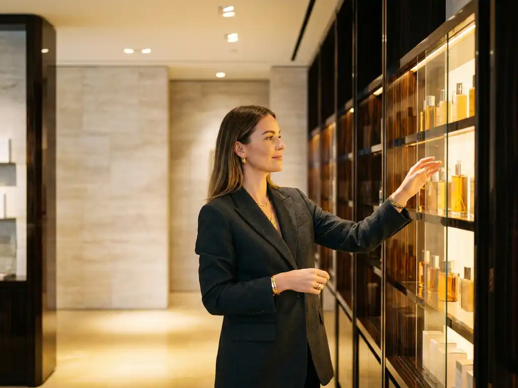
Yes, store layout can meaningfully reduce purchase hesitation. A well-designed retail environment removes the friction points that cause shoppers to pause, second-guess, or abandon a purchase entirely. When the physical space guides shoppers logically toward a decision, hesitation decreases and conversion increases. The questions below unpack the specific mechanisms, techniques, and display strategies that make this possible.
Store layout shapes shopper decision-making by controlling the physical journey through a retail environment. The sequence in which a shopper encounters products, signage, and fixtures directly influences what they notice, consider, and ultimately purchase. A layout that aligns with natural movement patterns reduces cognitive load and makes purchasing feel intuitive rather than effortful.
The relationship between space and behaviour is well established in retail design. When a shopper enters a store, they immediately process environmental cues: sightlines, product density, signage hierarchy, and aisle width. Each of these signals communicates whether a space is easy to navigate or overwhelming. Layouts that create clear, logical product pathways reduce the mental effort required to shop, which in turn reduces the likelihood of a shopper walking away undecided.
Retail store design also influences dwell time. Longer dwell time in the right zones typically correlates with higher engagement and stronger purchase intent. Brands that understand this invest in fixture placement and category flow as deliberately as they invest in the product itself.
Purchase hesitation at the point of sale is most commonly caused by insufficient product information, poor fixture organisation, visual clutter, and a lack of confidence in the purchase decision. When shoppers cannot quickly understand what a product does, how it compares to alternatives, or why it is worth the price, they default to inaction.
Several specific triggers contribute to hesitation at the fixture:
Understanding these hesitation triggers is foundational to designing retail displays that actively support the shopper rather than simply housing the product.
The layout techniques that most effectively reduce purchase hesitation are clear category zoning, logical product sequencing, strong visual hierarchy, and deliberate use of open space. These approaches reduce cognitive friction by making it easier for shoppers to orient themselves, find what they need, and evaluate their options without feeling overwhelmed.
Category zoning groups related products in a way that mirrors how shoppers think about their needs rather than how a retailer organises its supply chain. When shoppers can locate a category intuitively, they arrive at the fixture already in a purchasing mindset. From there, product sequencing within the fixture matters: leading with entry-level or well-known products before moving to premium or specialist options creates a natural decision pathway.
Visual hierarchy within displays is equally important. Clear price callouts, benefit-led messaging, and consistent brand colour usage allow shoppers to scan and assess quickly. Open space around key products signals importance and gives the eye a place to rest, reducing the sense of sensory overload that often accompanies hesitation.
Point of sale displays support hesitant shoppers by delivering the right information at the exact moment of decision. A well-designed POS display acts as a silent salesperson, communicating product benefits, usage guidance, and brand credibility without requiring staff intervention. This is particularly valuable in self-service retail environments where shoppers make decisions independently.
Effective POS design addresses hesitation through several functional and emotional mechanisms. On a functional level, it provides the factual reassurance shoppers need: what the product does, who it is for, and how it differs from adjacent options. On an emotional level, it reinforces brand trust through considered aesthetics, quality materials, and consistency with wider brand identity.
The physical construction of a display also plays a role. A fixture that feels premium and stable communicates that the brand behind it takes quality seriously. Conversely, a poorly made or visually inconsistent display undermines confidence in the product itself, even before the shopper has read a single word of copy.
Permanent displays are built for long-term fixture integration and brand consistency, while temporary displays are designed for promotional periods, product launches, or seasonal campaigns. Both can reduce purchase hesitation, but they do so in different ways and at different points in the shopper journey.
Permanent displays establish a reliable, familiar presence within a retail environment. Over time, shoppers recognise the fixture as part of the store's landscape, which builds brand familiarity and reduces the effort required to locate and engage with the product. These displays are typically constructed from more durable materials and are designed to withstand the wear of a high-traffic retail environment.
Temporary displays, by contrast, are optimised for impact at a specific moment. A well-executed promotional display can interrupt a shopper's routine, introduce a new product, and communicate a time-sensitive reason to purchase. The urgency and novelty of a temporary display can directly counter hesitation, particularly when the display is positioned in a high-visibility location and supported by strong messaging.
The most effective retail strategies use both: permanent fixtures to build baseline brand presence and temporary displays to drive conversion during key commercial moments.
Yes, store layout strategy should differ by retail environment. A pharmacy, a department store, a supermarket, and a specialist retailer each attract shoppers with different mindsets, different levels of product knowledge, and different expectations of the in-store experience. A layout strategy that works in one environment may actively underperform in another.
In a pharmacy, shoppers are often seeking solutions to specific concerns and may feel uncertain or vulnerable. Layouts and displays in this environment benefit from clear category signage, reassuring copy, and a sense of clinical credibility. Fixtures that feel cluttered or confusing can amplify anxiety and increase hesitation significantly.
In a department store or beauty retailer, the shopper experience is more exploratory. Here, the layout can afford to be more experiential, with space given to brand storytelling, tactile engagement, and aspirational visual merchandising. The goal shifts from reducing confusion to inspiring desire and building emotional connection.
In high-footfall environments such as supermarkets, speed of decision is paramount. Layouts and POS materials must communicate value and relevance within seconds, as shoppers move quickly and rarely pause without a strong prompt. Simplicity, boldness, and clarity are the defining principles of effective retail display in these contexts.
Pivotal designs, manufactures, and installs retail display solutions that directly address the causes of purchase hesitation. With over 2,000 new retail and brand experiences installed in 2025 and in-store engineers visiting a store every 34 minutes, Pivotal operates at a scale and pace that reflects the demands of modern retail. The capabilities that make this possible include:
For brand owners and marketing directors looking to convert hesitant shoppers into confident buyers, the quality of the in-store display is not a secondary consideration. It is a commercial lever. To discuss how Pivotal can strengthen your brand's in-store presence, get in touch with the team.