
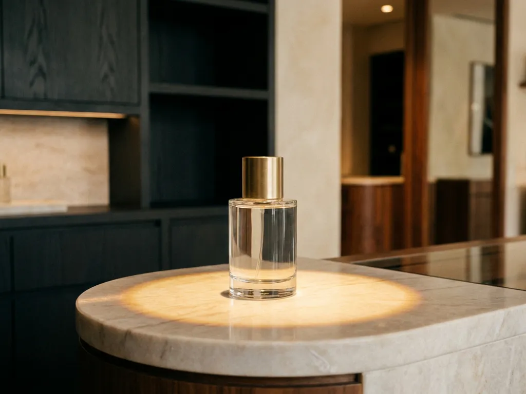
Premium brands signal quality through space and design by exercising deliberate restraint, investing in superior materials, and engineering every sensory detail to reinforce brand positioning. The result is a retail environment where the space itself communicates status before a single product is touched or a price tag is read. The sections below address the specific design decisions that achieve this effect, from spatial layout and material selection to lighting strategy and cross-channel consistency.
A retail space feels premium when it balances visual clarity with sensory richness. Generous negative space, a controlled colour palette, high-specification materials, and precise lighting all contribute to an atmosphere that signals exclusivity. The absence of clutter is itself a design statement, communicating that each product displayed has been deliberately chosen and deserves the shopper's full attention.
Beyond individual elements, the relationship between them matters. Premium retail design is coherent rather than decorative. Every fixture, surface, and graphic works within a unified visual language that reflects the brand's identity. When these components are misaligned, even high-quality individual elements fail to produce a premium perception. Consistency across the environment is what elevates a space from attractive to authoritative.
Spatial layout communicates brand status by controlling how shoppers move through an environment and how much physical and visual space each product receives. Premium brands typically allocate more floor area per product, create clear sightlines, and use zoning to guide the shopper journey. The underlying message is that the brand does not need to compete for attention through density or noise.
The flow of a retail space also determines the quality of the shopping experience itself. Environments designed with generous circulation space invite exploration rather than forcing transactional movement. This distinction, between a space that encourages browsing and one that drives throughput, is one of the most reliable indicators of how a brand positions itself in the market. Premium brands invest in the former because the experience is part of the product proposition.
Materials and finishes are among the most immediate quality signals in a retail environment. Shoppers assess the credibility of a brand partly through the physical properties of the fixtures and displays surrounding its products. Solid timber, brushed metal, polished acrylic, and stone-effect laminates all carry different associations, and selecting the right combination for a brand's identity is a core discipline in premium retail design.
The tactile dimension is particularly significant. Shoppers who interact with a display, whether by touching a surface, opening a drawer, or lifting a product, form a quality judgement based on the physical feedback they receive. Lightweight, hollow, or poorly finished structures undermine brand perception regardless of the product inside. This is why premium brands specify materials not only for their visual impact but also for their structural integrity and tactile character.
Finish quality also affects longevity. A display that maintains its appearance through high footfall periods reinforces the brand's commitment to standards. One that shows wear, discolouration, or instability within weeks of installation sends the opposite signal. Material specification is therefore both a design decision and a brand protection decision.
Premium brands use lighting to direct attention, enhance product appearance, and create an emotional atmosphere that supports their positioning. Targeted accent lighting draws the eye to hero products, while ambient lighting establishes the overall mood of the space. The combination of these two layers, controlled with precision, produces an environment that feels curated rather than functional.
Colour temperature is a particularly powerful variable. Warm white tones create intimacy and warmth, appropriate for beauty, fragrance, and lifestyle categories. Cooler, crisper light suits technology, health, and performance brands. Premium brands select colour temperature deliberately, aligning it with the emotional register of their product range rather than defaulting to standard retail specifications.
Shadow and contrast also contribute to perceived quality. Flat, uniform lighting flattens product texture and reduces visual interest. Directional lighting creates depth, highlights form, and makes products appear more considered and desirable. This is not a decorative choice but a commercial one: well-lit products at the point of sale consistently outperform those in poorly lit environments.
The key distinction between premium display design and standard point of sale is the degree to which the display is engineered to reflect brand identity rather than simply hold stock. Standard POS prioritises function and cost efficiency. Premium display design treats the fixture as a brand asset, specifying materials, proportions, finishes, and graphics that communicate the same values as the product itself.
Standard POS solutions are typically generic in form, designed to accommodate a range of products across multiple brands. They are efficient but interchangeable. Premium displays are bespoke, developed from a specific brief that begins with brand positioning and shopper insight. The result is a physical structure that could not belong to any other brand, a distinction that is visible and felt by shoppers even when they are not consciously aware of it.
The production process also differs. Premium retail fixtures are typically manufactured with tighter tolerances, higher-grade materials, and more rigorous quality control. Rapid prototyping, CAD development, and material testing are standard stages in the development process, ensuring the finished display performs as intended across the full range of retail environments in which it will be placed.
Brands maintain a premium feel across different retail environments by developing a flexible design system rather than a single fixed display. This system defines the non-negotiable brand elements, materials, proportions, colour, typography, and finish standards, and then adapts them to the physical constraints of each environment. The result is consistency of brand perception without rigidity of form.
The challenge is significant. A brand placing displays in a department store, a pharmacy, and a specialist retailer simultaneously faces very different space allocations, lighting conditions, and shopper demographics. Each environment requires a tailored solution, but all solutions must read as unmistakably the same brand. This requires design capability, manufacturing precision, and project management discipline working in coordination across the full deployment.
Compliance and installation quality are equally important. A premium display that is incorrectly positioned, poorly assembled, or inconsistently branded across locations undermines the entire investment. Brands that treat installation as a strategic function, rather than a logistical afterthought, maintain their premium perception at every touchpoint.
Pivotal is a full-service retail design partner that supports brands across every stage of the in-store design process, from initial concept and shopper insight through to manufacturing, installation, and compliance. For brands seeking to establish or maintain a premium retail presence, Pivotal provides the end-to-end capability required to execute at the standard the positioning demands.
In 2025 alone, Pivotal installed over 2,000 new retail and brand experiences, with in-store engineers visiting a store every 34 minutes. That operational scale, combined with bespoke design capability, is what allows premium brands to maintain consistency and quality across complex, multi-site deployments. To discuss how your brand's in-store presence can be elevated, get in touch with Pivotal.