
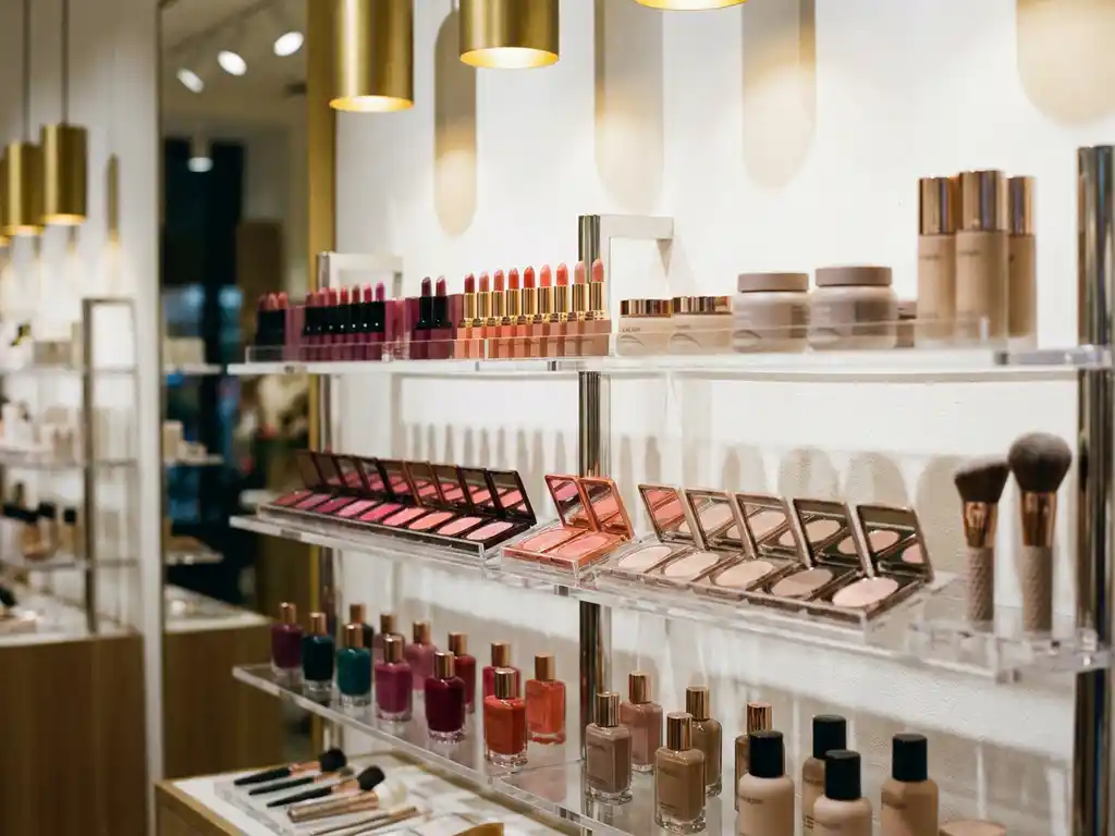
Colour theory in visual merchandising works by using the psychological and perceptual properties of colour to direct shopper attention, communicate brand values, and influence purchasing behaviour at the point of sale. The right colour strategy creates visual hierarchy within a display, draws the eye to key products, and reinforces the emotional tone of a brand. The sections below address the most important practical questions brands and retailers face when applying colour theory to in-store environments.
High-contrast, warm, and saturated colours are the most effective at attracting shoppers to a retail display. Red, orange, and yellow generate immediate visual attention because the human eye processes warm wavelengths faster than cool ones. These colours signal urgency and energy, making them particularly effective for promotional or impulse-purchase displays. Cool tones such as blue and green attract attention more gradually but sustain it longer, which suits considered or premium purchases.
The key principle is contrast rather than brightness alone. A display that uses a bold accent colour against a neutral or complementary background will draw the eye more reliably than one that relies on a single vivid colour throughout. In busy retail environments where multiple brands compete for visual space, contrast is what separates a display that gets noticed from one that disappears into the fixture landscape.
Colour saturation also plays a role. Highly saturated colours communicate energy and value, while desaturated or muted tones suggest quality, restraint, and premium positioning. Brands in the beauty, wellness, and lifestyle sectors frequently use this distinction to signal where their product sits in the market before a shopper reads a single word of copy.
Colour psychology influences buying decisions by triggering emotional and associative responses that shape how shoppers perceive a product before they consciously evaluate it. Colours carry culturally embedded meanings that affect trust, appetite, urgency, and perceived value. In retail design, these associations are not incidental - they are a primary tool for communicating brand identity and driving conversion at the point of purchase.
Red is consistently associated with urgency, excitement, and promotional pricing, which is why it dominates sale signage across retail categories. Blue builds trust and calm, making it the dominant colour in healthcare, financial services, and personal care. Green signals naturalness, sustainability, and health, which explains its prevalence in organic, wellness, and eco-conscious product ranges. Black and gold communicate luxury and exclusivity, and are used extensively in premium beauty and fragrance displays.
These responses are not purely rational. Research in consumer behaviour consistently demonstrates that a significant proportion of initial product assessments are based on colour alone. For brands investing in in-store retail design, colour psychology is therefore not a decorative consideration but a commercial one. The emotional register a display establishes in the first seconds of shopper contact directly affects dwell time, product interaction, and ultimately purchase intent.
The 60-30-10 rule in visual merchandising is a colour proportion guideline that structures how colour is distributed across a display or retail environment. Sixty percent of the space uses a dominant base colour, thirty percent uses a secondary supporting colour, and ten percent is reserved for an accent colour. This ratio creates visual balance while maintaining enough contrast to direct the shopper's eye to the most important elements.
The dominant 60 percent is typically a neutral or brand-aligned background colour that establishes the overall tone without competing with the product. The secondary 30 percent introduces the brand's primary colour or a complementary tone that adds depth and structure. The accent 10 percent is where the most impactful colour choices are made - this is the colour that draws attention to a specific product, call to action, or promotional message.
Applied correctly, the 60-30-10 rule prevents the visual noise that undermines many retail displays. When too many colours compete at equal weight, the shopper's eye has no clear path to follow and engagement drops. The rule provides a disciplined framework that works across categories, from pharmacy fixtures to fashion displays, and scales from a single POS unit to a full shop-in-shop environment.
Complementary colours sit opposite each other on the colour wheel and create high contrast when paired, making them effective for drawing attention and creating visual energy. Analogous colours sit adjacent on the colour wheel and produce harmonious, cohesive combinations that feel calm and considered. In retail display design, the choice between these approaches depends on the commercial objective and the brand's positioning.
Complementary pairings such as blue and orange, or red and green, generate immediate visual tension that the eye is drawn to resolve. This tension is commercially useful in high-traffic environments where a display needs to compete for attention quickly. Promotional displays, seasonal activations, and impulse-purchase fixtures frequently use complementary colour combinations to create the visual impact needed to interrupt a shopper's path. The risk with complementary pairings is overuse - if the contrast is applied without restraint, the display can feel aggressive rather than inviting.
Analogous schemes, such as blue, blue-green, and green, or red, orange, and yellow, create a sense of coherence and brand consistency. They are particularly effective for premium and lifestyle brands where the display experience needs to feel curated rather than promotional. In beauty and wellness retail, analogous palettes reinforce the sensory and emotional tone of a product range, supporting the shopper's perception of quality and brand integrity. The trade-off is lower immediate contrast, which requires stronger structural or typographic elements to guide the eye.
Colour choices in retail displays should adapt to the ambient lighting, surrounding fixture colours, shopper demographics, and category conventions of each retail environment. A colour palette that performs well in a department store may be entirely ineffective in a pharmacy or a supermarket. Effective retail colour strategy requires understanding the specific visual context in which a display will operate before any design decisions are made.
In pharmacy and health retail environments, clean whites, light blues, and greens dominate because they reinforce clinical credibility and trust. A display using warm promotional colours in this context can feel out of place and undermine the brand's authority in that category. In contrast, food and beverage environments frequently use warm, saturated colours to stimulate appetite and energy, reflecting category norms that shoppers already associate with quality and taste.
Department stores and premium fashion retailers operate in environments where the ambient colour palette tends toward neutrality, allowing individual brand displays to use stronger colour as a differentiator. In these settings, a well-executed complementary or bold analogous palette can make a brand's fixture stand out significantly within the broader retail floor. Lighting conditions also affect colour perception substantially - colours that appear vibrant under cool LED lighting may appear flat under warm incandescent sources, making it essential to test colour choices under the actual in-store lighting before production.
The most damaging colour mistakes in retail displays are using too many colours without a clear hierarchy, ignoring the surrounding retail environment, and selecting colours that conflict with the brand's existing identity. These errors reduce visual clarity, weaken brand recognition, and ultimately diminish the commercial effectiveness of the display regardless of how well it is constructed or positioned.
Avoiding these mistakes requires a structured approach to colour decision-making that begins with the retail environment and works back to the display, rather than the reverse.
Pivotal brings colour strategy into every stage of the retail display design and development process, ensuring that colour decisions are grounded in shopper psychology, brand identity, and the specific retail environment in which a display will operate. As a full-service retail design partner, Pivotal's capabilities include:
Pivotal installed over 2,000 new retail and brand experiences in 2025, with 15 new global brands choosing Pivotal as their in-store partner. If you are developing a display programme and want colour strategy built into the process from the outset, speak to the Pivotal team to discuss your brief.