
Colour psychology applies to retail display design by influencing how shoppers perceive, feel, and respond to products before they consciously evaluate them. The right colour choices can direct attention, communicate product value, and trigger emotional responses that drive purchase decisions. The questions below unpack the mechanics behind colour in retail, from shopper behaviour to testing methodology.
Warm colours, particularly red and orange, are consistently associated with urgency and appetite stimulation, making them effective in promotional and food retail contexts. Cool tones such as blue and green signal trust, calm, and quality, which is why they dominate healthcare, beauty, and premium product displays. Colour triggers buying behaviour not through universal rules, but through the emotional associations shoppers bring to each hue.
Red, for instance, is widely used in clearance and sale signage because it creates a sense of urgency and captures attention quickly. Orange carries energy and accessibility, making it a natural fit for value-led brands. Blue builds credibility and is strongly associated with reliability, which is why it appears frequently in pharmacy and personal care environments. Green communicates naturalness and ethical production, increasingly important in wellness and sustainable product categories.
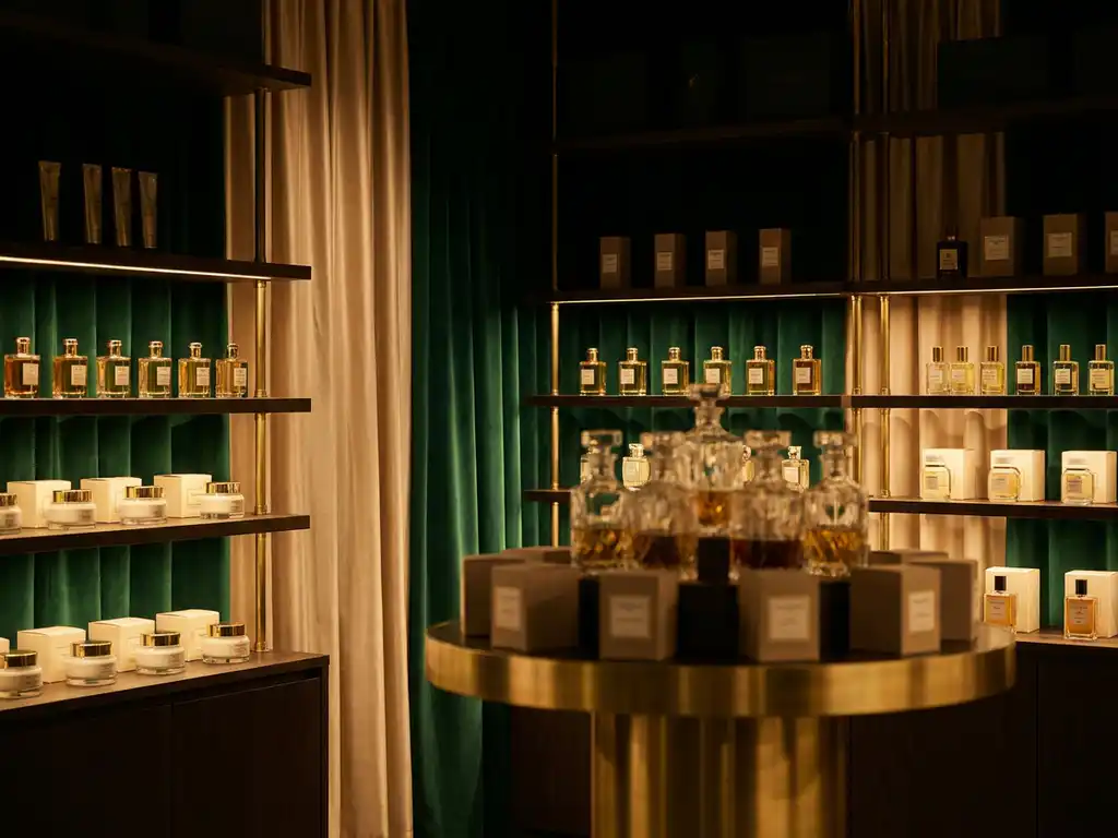
Black and gold together signal luxury and exclusivity, elevating perceived product value without a word being written. White conveys cleanliness and simplicity, a dominant palette choice in premium skincare and minimalist lifestyle brands. Understanding which emotional register a colour activates allows brands to align their display design with the buying mindset they want to encourage.
Colour is one of the fastest-processed visual signals in the human brain, which means it determines whether a display captures attention before a shopper reads a single word of copy. At the point of sale, colour contrast, saturation, and placement work together to draw the eye toward specific products or calls to action. A display that blends into its retail environment will consistently underperform, regardless of the quality of the product it promotes.
High contrast between a display and its surrounding shelf or fixture creates what designers refer to as a visual interrupt. This is the moment a shopper's eye breaks from scanning and lands on a specific point. Brands that understand in-store display design use this principle deliberately, selecting display colours that stand out from the ambient tones of the retail environment rather than simply matching their brand palette.
Saturation also plays a role. Highly saturated colours attract attention in cluttered retail environments, while muted or pastel tones work more effectively in curated, premium settings where the shopper is already engaged and browsing attentively. The context of the retail environment should always inform saturation decisions, not just brand guidelines.
Yes, colour strategy in retail displays varies significantly by product category because each sector carries its own set of shopper expectations and emotional associations. A colour that signals trust in a pharmacy context may communicate coldness in a fashion environment. Effective retail colour strategy is built on an understanding of category conventions and where a brand wants to sit within or against them.
In beauty and skincare, soft neutrals, blush tones, and clean whites communicate refinement and skin sensitivity. Premium skincare brands frequently use black and gold to signal prestige. In contrast, mass-market health and wellness products often lean on greens and blues to communicate natural ingredients and clinical efficacy.
Food and beverage displays commonly use warm reds, oranges, and yellows to stimulate appetite and create energy. Fashion and lifestyle brands have greater latitude, often using bold, trend-led colour choices that reflect seasonal identity rather than fixed category rules. Sports and performance products frequently employ high-contrast combinations, particularly black with bright accent colours, to communicate intensity and ambition.
Understanding category norms is the starting point. Brands that choose to break from convention do so deliberately, using unexpected colour choices to differentiate and create standout. This only works when the deviation is intentional and supported by the broader display design.
Brand colours are defined in a company's identity guidelines and are designed for consistency across all touchpoints, from packaging to digital. Display colours are chosen specifically for the retail environment and are optimised for visibility, contrast, and shopper engagement in a physical space. The two should be related, but they are not always identical, and treating them as interchangeable is a common retail design error.
A brand's primary colour may work beautifully on a website or product label but disappear entirely against a busy retail shelf. Display design must account for the ambient lighting of the retail environment, the colours of surrounding products and fixtures, and the distance from which shoppers will first encounter the display. These are physical constraints that brand guidelines rarely address.
The most effective approach is to use brand colours as the anchor and introduce display-specific accent colours or contrast elements that ensure visibility without undermining brand recognition. This might mean using a brand's secondary colour as the dominant display tone, or introducing a neutral background that allows the brand colour to read clearly. The goal is always coherence with the brand identity and performance within the retail context.
Testing whether a colour choice is working in-store requires a combination of observational data, shopper feedback, and sales performance analysis. No single method provides a complete picture, but together they reveal whether a display colour is driving attention, engagement, and conversion as intended. Testing should be built into the display development process rather than treated as an afterthought.
Observational research, including heat mapping and eye-tracking studies conducted in-store or in simulated retail environments, can reveal where shoppers look and how long they engage with a display. This data identifies whether the colour is creating the intended visual interrupt or being overlooked entirely.
Shopper intercept interviews provide qualitative context, capturing the emotional and perceptual responses that quantitative data cannot explain. A colour might attract attention but communicate the wrong brand values, which would show up in interview responses even if foot traffic data appears positive.
Sales uplift data, measured by comparing performance before and after a display is introduced or refreshed, provides the most commercially relevant measure of whether colour choices are working. A/B testing, where two colour variants of the same display are deployed in comparable retail environments, offers the most controlled comparison available outside a laboratory setting.
Pivotal's retail display design service supports brands at every stage of the colour and design decision-making process, from initial concept through to in-store installation. For brands seeking to strengthen their point of sale presence, Pivotal brings together creative expertise, materials knowledge, and category experience to ensure that every display performs in the real retail environment. Key capabilities include:
Colour decisions made without retail context risk producing displays that look correct on screen but underperform on the shop floor. Pivotal's design and development team works with brand owners, marketing directors, and retail experience managers to close that gap. To discuss your next retail display project, get in touch with the Pivotal team.