
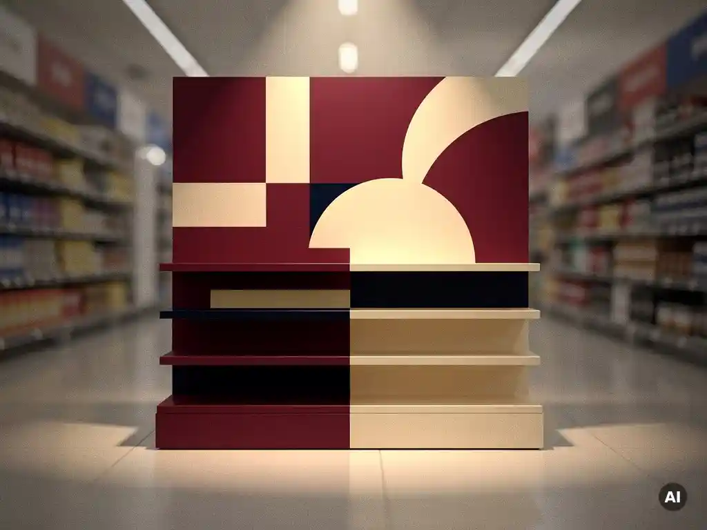
Colour and typography are two of the most powerful tools in POS display design, directly shaping whether a shopper stops, engages, and converts at the point of purchase. Together, they communicate brand identity, guide the eye, and signal product value within seconds. The questions below unpack how each element works, where brands commonly go wrong, and when it is time to reconsider your approach.
Shoppers respond to colour in POS displays within milliseconds, often before they have consciously registered the product itself. Colour triggers an immediate emotional and perceptual response that influences dwell time, perceived product quality, and purchase intent. In a competitive retail aisle, the right colour palette can be the difference between a display that commands attention and one that disappears into the shelf.
Retail display colour psychology is well established across the industry. Warm tones such as red and orange create urgency and draw the eye, making them effective for promotional and impulse-purchase displays. Cool tones such as blue and green communicate trust, calm, and efficacy, which is why they dominate pharmacy and wellness environments. Neutral palettes signal premium positioning and restraint, often used in prestige beauty and lifestyle categories.
Critically, shoppers do not evaluate colour in isolation. They compare it against the surrounding retail environment. A display that reads clearly in isolation may be lost against a busy backdrop. Effective POS visual design accounts for the context in which the display will live, not just how it looks on screen or in a render.
Typography in retail displays communicates brand personality, establishes hierarchy, and determines whether a shopper can absorb the key message in the time available. In-store, that window is extremely short. A shopper moving through a retail aisle may give a display no more than two to three seconds of attention, which means typeface choice, sizing, and layout must do significant work very quickly.
Hierarchy is the most important typographic principle in point-of-sale design. The primary message, whether a price, a claim, or a product name, must be immediately legible from the relevant viewing distance. Secondary copy supports rather than competes. When all text elements carry equal visual weight, the display fails to guide the eye and the message is lost.
Typeface selection also carries brand meaning. A serif font signals heritage and authority. A geometric sans-serif communicates modernity and precision. A handwritten or script typeface suggests craft, warmth, or artisanal values. These associations are immediate and largely subconscious, which is why in-store display typography must be chosen with the same rigour applied to any other brand asset.
Colour and typography work together on a POS display by creating visual contrast, establishing legibility, and reinforcing brand coherence. Neither element functions optimally in isolation. A strong typeface loses impact if it sits on a colour that reduces contrast or competes with the letterforms. A compelling colour palette fails if the typography it supports is poorly sized, poorly spaced, or tonally mismatched.
The relationship between background colour and type colour is fundamental. High contrast between these two elements ensures legibility across varying retail lighting conditions, which can differ significantly between a pharmacy, a department store, and a supermarket. Low-contrast combinations may appear refined in controlled conditions but become illegible under fluorescent lighting or at a distance.
Beyond contrast, colour and type must align in brand register. A premium brand using refined neutral tones must pair those colours with typography that carries equivalent weight and restraint. A mismatch between a sophisticated colour palette and a casual or poorly kerned typeface creates a disconnect that shoppers sense even if they cannot articulate it. Consistency between these two elements is what makes a POS display feel authoritative and intentional rather than assembled.
The most common mistakes in POS display design involve prioritising visual impact over legibility and applying brand guidelines developed for digital or print contexts without adapting them for the physical retail environment. Both errors undermine the commercial effectiveness of the display.
Colour and typography conventions differ significantly across retail sectors because each category carries its own set of shopper expectations, trust signals, and purchase motivations. Effective point-of-sale design works within these conventions while finding space to differentiate within them.
In pharmacy and health retail, colour palettes tend towards clinical whites, blues, and greens, reinforcing efficacy and safety. Typography is typically clean, legible, and restrained, reflecting the authority expected of health-related claims. Pivotal has worked extensively in this space, including retail POS for Beiersdorf and display programmes for brands such as Eucerin and Avène, where the balance between clinical credibility and consumer appeal is central to the design brief.
In prestige beauty and lifestyle, the palette shifts towards neutrals, golds, and deep tones that signal luxury. Typography becomes more considered, often using refined serif or geometric typefaces with generous spacing. In food and beverage, appetite appeal drives colour choices, with warm, saturated tones that stimulate desire. In fashion, the display itself is often expected to recede, allowing the product to lead, with colour and type used sparingly and with precision.
Understanding these sector norms is not about following convention uncritically. It is about knowing which expectations to meet and which to deliberately challenge in order to create standout within a relevant context.
A brand should refresh its POS display colours and typography when the current treatment no longer accurately reflects the brand's positioning, when it is underperforming against competitor displays in the same retail environment, or when a significant product, packaging, or identity change has created a disconnect between the display and the product it supports.
Practical triggers for a refresh include a rebrand or brand evolution, a new product line launch, a change in retail channel or retail partner, or a shift in the target consumer. A display developed for one retail context, such as a specialist health store, may be entirely misaligned when the brand secures distribution in a major department store or pharmacy chain.
Beyond strategic triggers, there is also a case for regular review based on retail environment changes. Retailers update their store layouts, fixture systems, and lighting at intervals, and a display that performed well in a previous environment may lose effectiveness when those conditions change. Brands that treat their retail display colour and typography as fixed assets rather than live commercial tools risk falling behind in environments where competitor displays are continuously evolving.
Pivotal works with brands from initial concept through to installed display, ensuring that colour and typography decisions are made with full awareness of the retail environment, production realities, and brand objectives. As a full-service retail design partner, Pivotal brings together creative expertise and manufacturing precision so that what is designed is what gets built and installed.
If your current POS displays are not delivering the standout your brand deserves, contact Pivotal to discuss how a considered approach to colour and typography can drive stronger results at the point of purchase.