
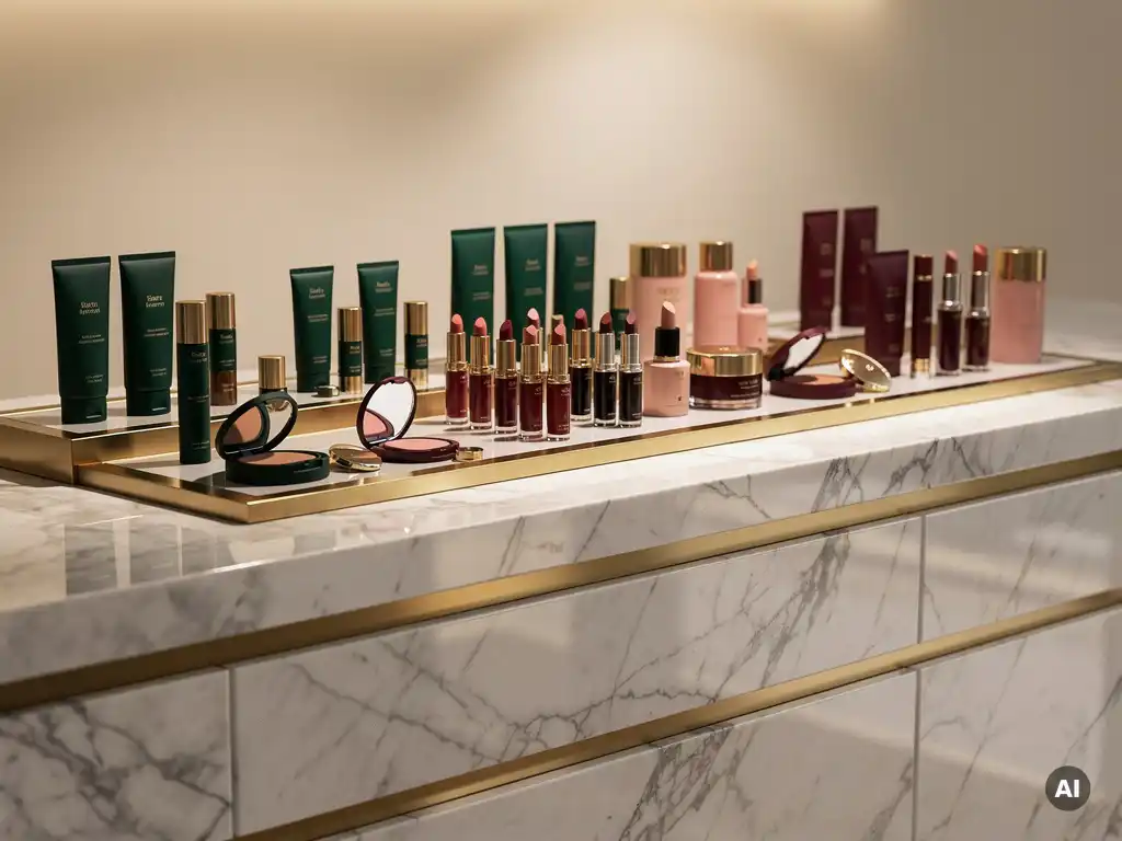
Colour is one of the most powerful tools in retail brand identity, shaping how shoppers perceive a brand before they read a single word. A well-chosen colour palette communicates brand values, triggers emotional responses, and creates instant recognition across every physical touchpoint. The following sections explore the specific questions that brand owners and retailers ask most frequently about colour strategy in retail environments.
Colour influences shopper behaviour by triggering immediate emotional and psychological responses that affect purchasing decisions, dwell time, and brand perception. In a physical retail environment, colour signals are processed faster than text or imagery, meaning a store's colour scheme begins communicating before a shopper consciously registers it. Warm tones tend to create urgency and stimulate impulse purchases, while cooler palettes encourage browsing and deliberation.
The practical implications for retail chain operators are significant. Research in colour psychology consistently shows that shoppers form an initial impression of a store or display within seconds, and colour accounts for a substantial portion of that first judgement. Red, for example, is widely associated with sales and urgency in retail contexts. Blue communicates trust and reliability, which is why it features prominently in financial services and pharmacy retail. Green signals natural credentials and sustainability, a positioning that has become increasingly commercially valuable as consumer expectations around environmental responsibility have risen.
Beyond individual colour associations, contrast plays a critical role in directing attention. High-contrast colour combinations on fixtures and displays draw the eye to priority products, guiding the shopper journey through the store in ways that support both sales performance and brand storytelling.
Different colours communicate distinct brand values and emotional signals that shape how shoppers relate to a brand. In retail brand identity, colour choice is rarely arbitrary. Each hue carries cultural, psychological, and category-specific associations that either reinforce or undermine the brand's intended positioning.
For brands operating across multiple categories or markets, the challenge is ensuring that colour choices remain coherent with both the brand's core identity and the expectations of each retail sector. A premium skincare brand entering a pharmacy environment, for instance, must balance its luxury positioning with the clinical associations shoppers already bring to that setting.
Retailers choose a consistent colour palette by anchoring every touchpoint to a defined set of primary and secondary brand colours, applied through a structured set of usage guidelines that govern how those colours appear across fixtures, signage, packaging, displays, and digital environments. Consistency is achieved through discipline, not repetition of a single shade in isolation.
In practice, building a coherent retail colour palette involves several deliberate steps. First, the primary brand colour must be identified and tested across different materials and lighting conditions, since colour behaves differently on acrylic, metalwork, printed graphics, and digital screens. A shade that reads correctly on screen may appear muted or distorted when applied to a physical display under in-store lighting.
Second, retailers need to define how secondary and accent colours interact with the primary palette. These supporting colours carry the visual workload across seasonal campaigns, promotional displays, and category differentiation without breaking brand recognition. Finally, a clear hierarchy of colour usage ensures that no single execution feels disconnected from the broader brand identity, whether it appears in a flagship store, a concession unit, or a temporary promotional display.
Brand colour refers to the specific hues owned and consistently used to identify a brand across all communications, while store environment colour describes the broader palette used to design the physical atmosphere of a retail space. The two serve different but complementary purposes, and confusing them leads to environments that either feel visually incoherent or fail to serve the shopper's in-store experience.
Brand colours are typically fixed and tightly controlled. They appear on logos, packaging, point-of-sale materials, and display fixtures to create recognition and continuity. Store environment colours, by contrast, are chosen to support the overall shopping atmosphere, influence dwell time, and guide movement through the space. A retailer might use neutral, recessive tones on walls and flooring specifically so that branded fixtures and product displays stand forward visually.
The most effective retail environments treat brand colour and environment colour as a system rather than separate decisions. When the two are designed in relation to each other, brand visibility increases and the shopper experience feels considered rather than accidental. This is particularly important for brands operating within multi-brand retail environments such as department stores or pharmacy chains, where the store environment colour is largely fixed and brand colour must work harder to create distinction.
Retail brands change their colours over time to reflect shifts in brand positioning, target audience, competitive landscape, or cultural context. A colour palette that was distinctive and relevant at launch can become dated or misaligned with the brand's current direction, making a strategic colour refresh a legitimate and commercially motivated decision rather than a cosmetic one.
Several factors typically drive a colour change. A brand repositioning toward a premium or sustainable proposition may move away from bright, high-energy palettes toward more restrained or natural tones. Equally, a brand seeking to attract a younger demographic may introduce more contemporary colour combinations to signal relevance. In competitive categories, colour differentiation becomes important when a market becomes crowded with similar-looking brands, prompting a refresh to reclaim visual distinctiveness.
The commercial risk of changing brand colours should not be underestimated. Established colour associations carry significant equity, and a poorly executed change can erode recognition that has been built over years. Successful colour evolution tends to be incremental rather than abrupt, preserving enough visual continuity that loyal customers recognise the brand while signalling a credible step forward in positioning.
Colour in retail displays improves product visibility and sales by directing shopper attention, creating visual hierarchy, and reinforcing the brand signals that trigger purchase decisions. A display that uses colour strategically ensures that priority products stand out, that the brand is instantly recognisable, and that the overall presentation feels intentional rather than cluttered.
Contrast is the primary mechanism through which colour drives visibility. A product displayed against a background colour that creates strong contrast will attract the eye more effectively than one that blends into its surroundings. This principle applies to both the display structure itself and the graphic elements within it. Colour can also be used to segment a display by product range, price tier, or benefit, helping shoppers navigate quickly and locate the products most relevant to their needs.
Beyond visibility, colour on retail displays reinforces brand memory. Shoppers who encounter a brand's colour palette consistently across multiple touchpoints build stronger brand recall, which influences future purchasing behaviour even outside the store environment. For brands investing in permanent or semi-permanent display fixtures, the colour decisions made at the design stage carry long-term commercial weight.
Pivotal works with brands to translate colour strategy into physical retail displays that perform commercially and reflect brand identity with precision. As a full-service retail design company, Pivotal manages the entire process from concept through to installation, ensuring that colour decisions made at the design stage are executed accurately across materials including acrylic, metalwork, and printed graphics.
For brand owners and retail operators seeking to strengthen in-store presence through considered colour strategy, Pivotal provides the design capability, manufacturing expertise, and installation infrastructure to deliver results. Contact Pivotal to discuss how your brand's colour identity can be brought to life in physical retail.
The clearest indicators are shopper behaviour and brand recognition metrics. If customers struggle to identify your brand at a glance, if displays feel visually cluttered, or if sales performance varies significantly between locations with different colour executions, these are signals that your palette may not be working as hard as it should. A practical starting point is conducting an in-store audit across multiple locations to assess how consistently your brand colours are being applied and how they perform under real lighting conditions.
One of the most frequent mistakes is approving colours based on digital screen representations without testing them on physical materials under in-store lighting, which can cause significant colour drift between the intended and actual result. Another common error is treating brand colour and environment colour as the same decision, leading to displays that either disappear into their surroundings or clash with the broader store atmosphere. Brands also often overlook the need for a clear colour hierarchy, resulting in promotional and seasonal colours that gradually erode core brand recognition over time.
In a flagship store, a brand has full control over the environment, allowing colour to be used across architecture, flooring, lighting, and fixtures as a complete system. In a concession or shop-in-shop setting, the surrounding environment is largely fixed, so brand colour must work much harder in a smaller footprint to create distinction and recognition. In these contexts, concentrating colour on key brand touchpoints such as header panels, display structures, and packaging becomes critical, and contrast against the host retailer's environment should be considered from the outset of the design process.
Colour strategy is just as relevant for smaller or emerging brands, and in many cases it is even more commercially important because they have fewer touchpoints through which to build recognition. Effective colour strategy is not about the scale of investment but about the consistency and intentionality of application. Even a limited range of display materials — a header card, a shelf strip, and a product tray — can build strong brand recognition when colour is applied consistently and in line with a defined palette.
Colour associations are not universal, and a palette that communicates the right values in one market may carry unintended meanings in another. White, for example, is associated with purity and minimalism in many Western retail contexts but is linked to mourning in several East Asian cultures. For brands expanding internationally, it is worth auditing colour choices against the cultural context of each target market, particularly for packaging and in-store display materials. In most cases, the solution is not a complete colour overhaul but a considered adaptation of secondary and accent colours while preserving core brand recognition.
Colour decisions should ideally be made at the earliest stages of the design process, before material specifications and production timelines are confirmed. Changes to colour late in the production process can cause significant delays and cost overruns, particularly when specialist finishes or custom colour-matched materials are involved. Building in a prototyping phase early — where colour choices are tested on actual materials under representative lighting — saves time and budget downstream and ensures the final installation reflects the intended brand identity accurately.
Seasonal and promotional campaigns are an opportunity to introduce accent colours that signal newness and relevance while the core brand palette remains constant and recognisable. The key is to treat campaign colours as a layer applied over the established brand identity rather than a replacement for it, ensuring that primary brand colours remain prominent on all display materials. A clear set of brand guidelines that defines how promotional colours can be used — including proportions, approved combinations, and restricted applications — gives campaign teams creative flexibility without compromising the long-term equity of the brand's colour identity.