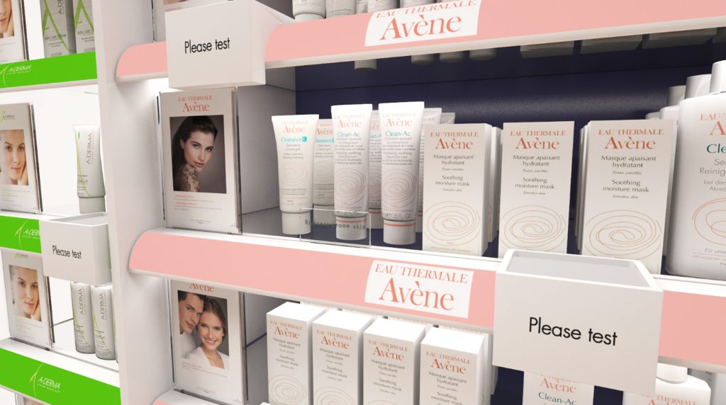
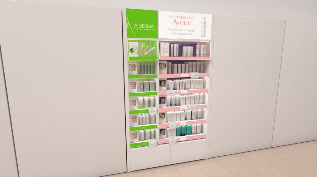
Avene briefed our team to create an efficient shopping destination for their skincare range. We were requested to design, develop, manufacture and install a bespoke unit display whilst would maintain a consistent brand image throughout. The idea behind this execution was to heighten their in-store presence, as well as maintaining the key look and feel of their products in the retail setting.
Our aim was to develop a unit which would entice customers to their products and increase the footfall on the shop floor. By doing so we designed a specific shelf edge system that incorporated LED illumination both above, below and inside the shelf edges. This added a contemporary and sophisticated effect, whilst adding an overall glamorous feel to the product display.

With this look in mind, it was vital for us to make sure Avene stood out for all the right reasons and against their skincare competitors,. We believe that the illumination made all the difference. The illumination helped consumers read the product packaging, Avene's ingredients and created a more enjoyable shopping experience.

Incorporating Graphic panels in the header and product exploitation - this meant that product highlighting was both educational and relatable.
The next great thing on incorporating graphic sleeves was flexibility for the client. Due to the sleeves being inclusive of acrylic 'holders', this meant that if there were any new launches - the POS could be easily changed without effecting/ changing the unit itself. We knew it was a vital idea to develop – this way the merchandisers in-store can adapt the graphics easily with very little hassle.
